Bloomer Collection
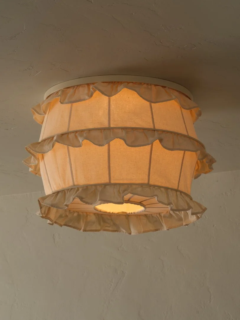

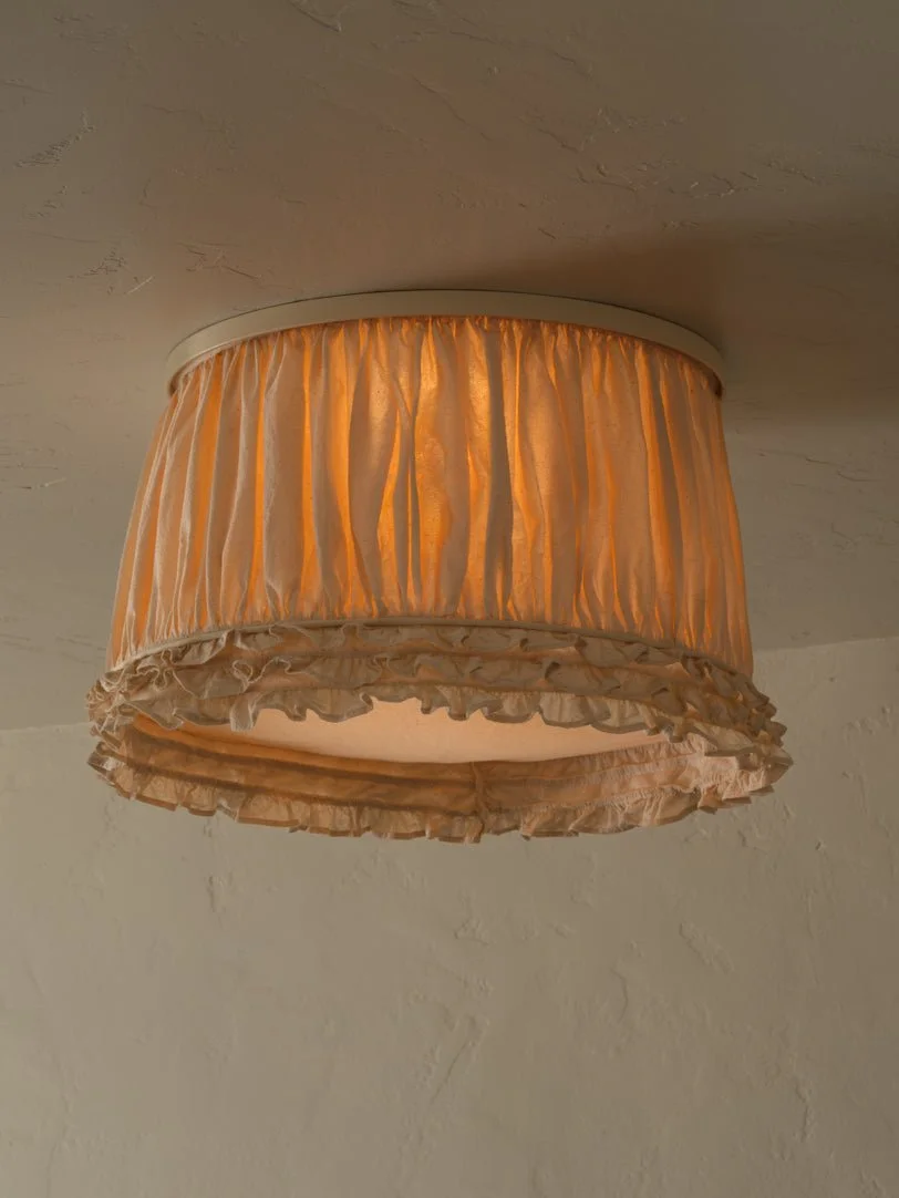
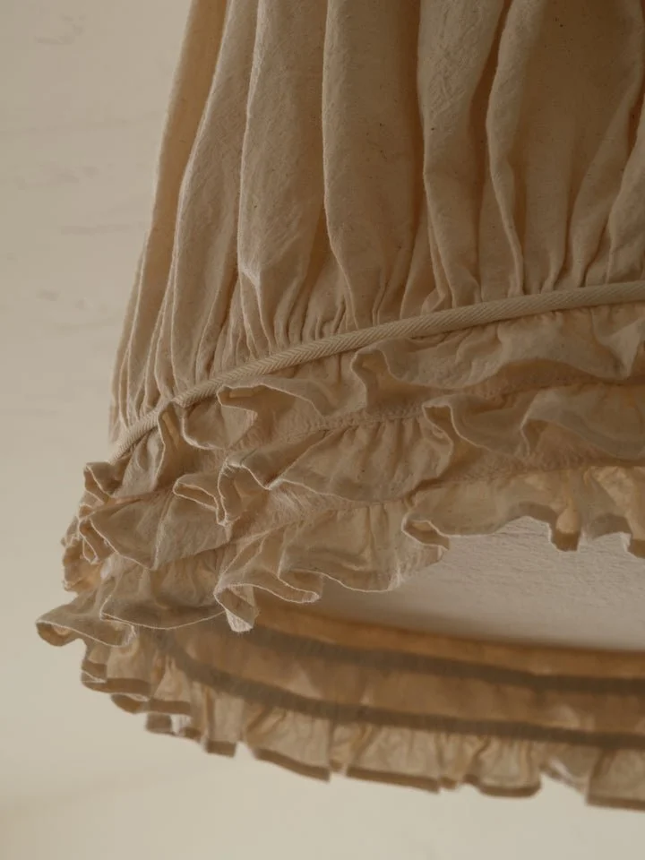
Gem Ruffles. This Shade reinterprets ornament as structure. Layered ruffles wrap the Gem’s classic silhouette, introducing texture, depth, and gentle movement inspired by the ruffling found on camisole tops.
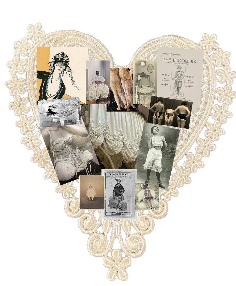
This collection was inspired by the evolution of women’s undergarments and the radical shifts in tailoring that redefined both movement and identity throughout history. From Amelia Bloomer, who challenged restrictive dress codes and reimagined freedom through reform garments, to Mary Edwards Walker, who wore her convictions as boldly as her clothing. What drew me most deeply into this research was the structural intelligence of these garments. Many of their most striking visual elements were not conceived for ornament, but for utility. Designed to support movement, autonomy, and practicality. Yet over time, these functional innovations became visually iconic. The proportions, pleating, gathering, and engineered shaping developed for purpose have since informed enduring standards of beauty and construction that continue to influence contemporary fashion and design.
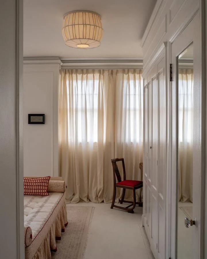
I was commissioned by Tulip to conceptualize and illustrate the design of the lamp shades, translating this historical research into form. The final collection consists of three distinct pieces: Gem Pleats, Lamp Gathered, and Gem Ruffle each drawing from historical structural techniques while reinterpreting them through a modern lens.
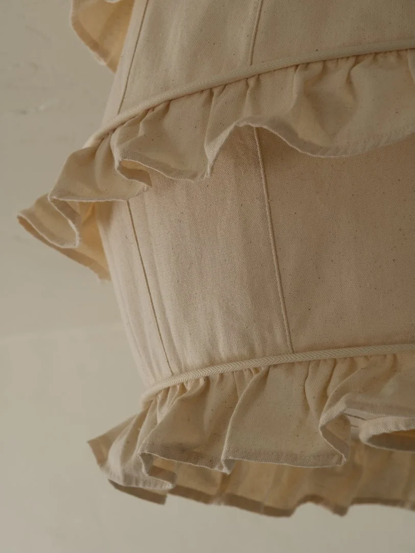
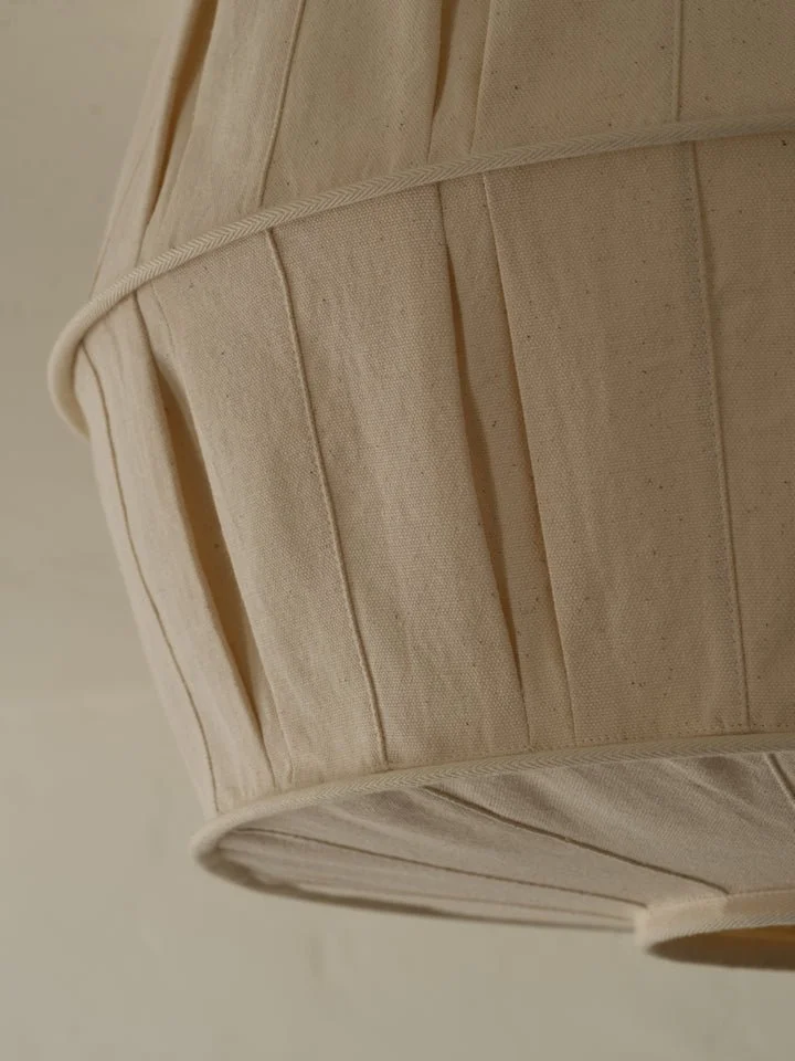
Lamp Gathered. Playful yet refined, this shade was designed with texture and the soft diffusion of light in mind. Intentionally bunched and stretched to achieve the gathered construction of the classic bloomer garment.
Conceptualized and designed by myself in collaboration with Tulip
Launched 1.27.26
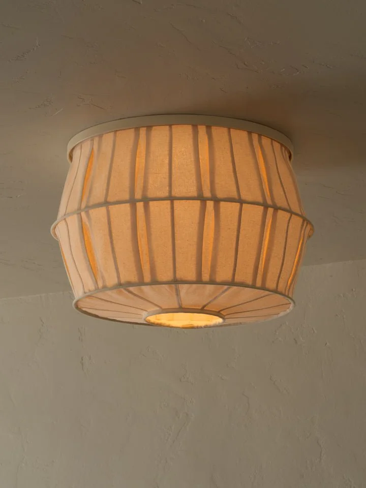
Gem Pleats. This shade takes the structure of classic tailoring and lets it breathe with precise folds that catch and release glow with every shift in light. Thoughtful, rhythmic, and subtlety graphic, it balances discipline with softness.
Asset Creation - Photo Editing - Website Design for Tulip
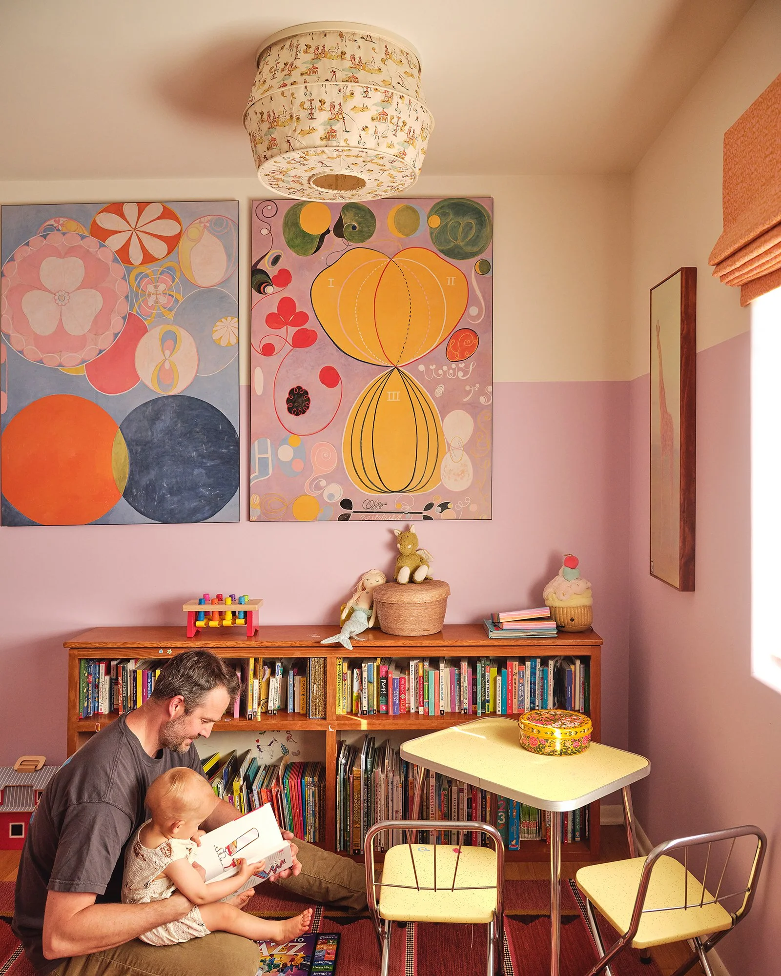
I render visual mockups to help guide design decisions. When a new collection is conceptualized, it’s my job to render the concepts—typically using Photoshop, Figma, and AutoCAD—then present them to our team. When a collection or colorway is finalized, the shades are produced and sent to us for photographing. Once photographed, I edit the photos—adjusting lighting, shadows, and color, or, if necessary, rendering entirely new shades into existing images. The image to the right is an example of a completely new shade rendered into an already existing photo. See below to learn more about my process.
In addition to digital design responsibilities, I occasionally assist with website code issues and edits. This includes resolving supply chain glitches in Shopify, creating new buttons and banners, and coding them to auto-generate when needed
Working on both digital and physical ad campaigns has also been a major part of my time at Tulip. One instance, I designed and printed over 100 labels, then tied them to individual tulips to hand out in Washington Square Park on National Tulip Day last spring. One of my favorite campaigns was Tulip x Eva Joan—scroll down to learn more about this project and my contributions.


I developed these unique editing skills with Tulip. The process involves analyzing the lighting, shadows, grain, and angles of both source and target images.
I start by sourcing an image of the shade at a similar angle to the target photo. Often, I had to manually distort the shade image to match the scene. Then, I’d remove the background, erase the existing lighting or shading in the target image, and place the new shade into the scene. The final and longest step involved fine-tuning lighting, shadows, color balance, and grain to match the environment. It was a challenge—but one I grew to really enjoy.
The images on the left show a simple example of this process. The one above demonstrates a more complex result, having to factor it and edit the painting behind the shade in the process.
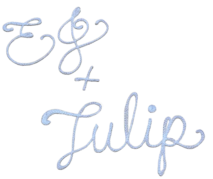
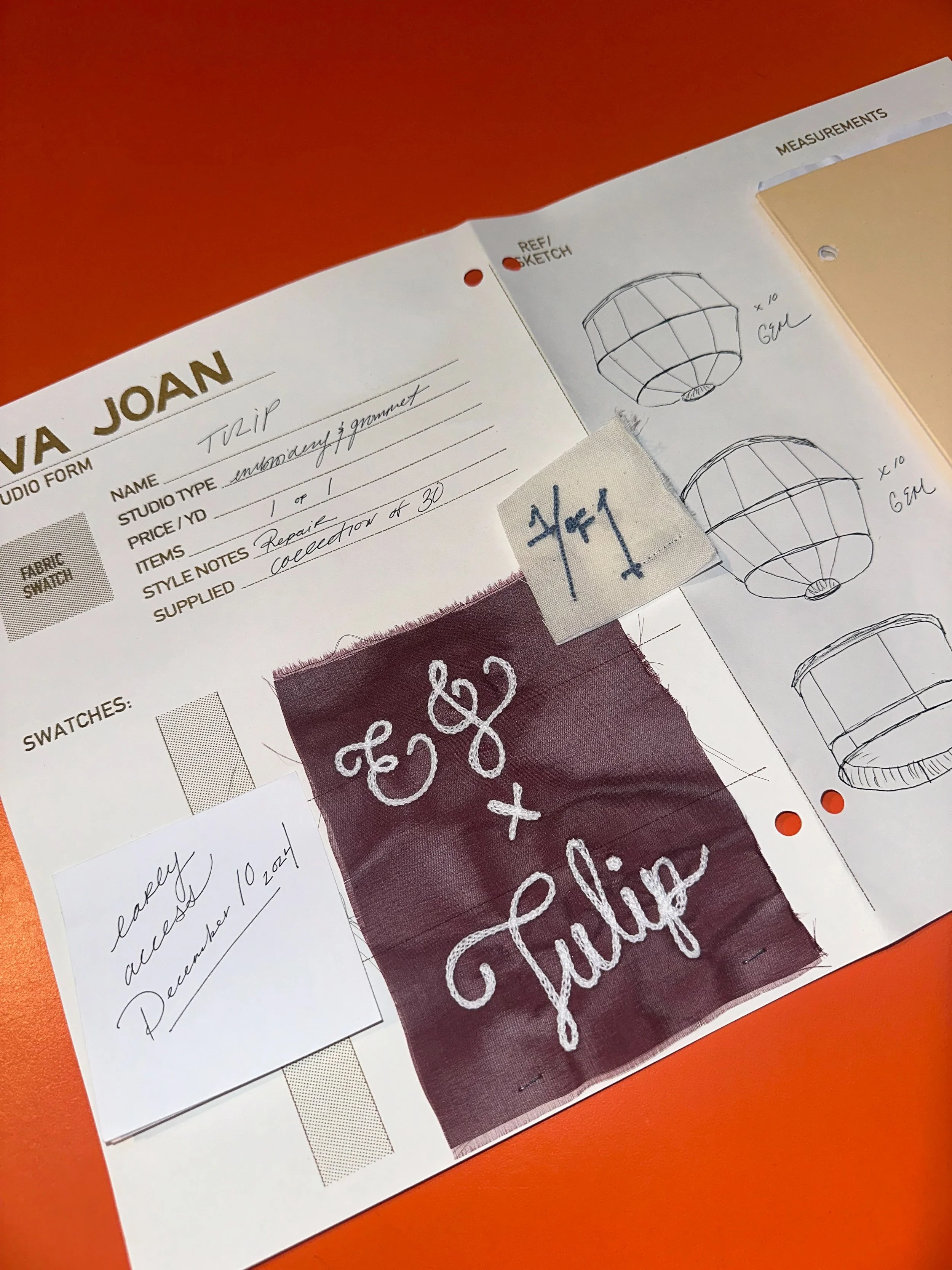
One of the most memorable projects I worked on at Tulip was our collaboration with Eva Joan. I was responsible for leading the conceptual design direction, which included developing the visual identity for the release. A centerpiece of this work was creating the EJ + Tulip logo, a process that combined both digital design and tactile craftsmanship.
I began by sketching and rendering an initial concept to pitch the vision for the collaboration. Once approved, I translated the design into a stitched version, working closely to ensure the handmade quality carried the essence of the brand partnership. The embroidery was then scanned and brought into a digital environment, where I refined the details through photo editing, color manipulation, and layout adjustments until the logo felt bold, cohesive, and versatile.
The finished design was used in many aspects of the campaign. We applied it to custom stationery, which was packaged with every order from the limited collection. As well as, being used as an asset across Tulip’s social media platforms, where it played a central role in promoting the collaboration and building excitement around the launch.
This project stands out to me not only for its creative challenges, but also for the way it merged craft, design, and brand storytelling into one cohesive experience. It was a true highlight of my time with Tulip.